- We use visualisation to present large or complex data sets in a way that enables our audience to grasp those complexities with the least amount of work possible on their part.
- One of the strengths of data visualisation is that it can reduce the time necessary for understanding a given event at the same time it augments the viewers capacity to grasp and interrelate the complex data.
- It’s much more than just representing a simple piece of information in a complex way. It is really about giving an audience tools to be able to analyse and make comparisons for themselves.
Florence Nightingale
- Florence Nightingale served as a trainer of nurses during the Crimean War, in which she organised and care for wounded soldiers.
- Nightingale realised that soldiers were dying of malnutrition, poor sanitation so she strove to improve the living conditions for the wounded troops. She kept meticulous records of the death tolls in hospitals as evidence of the importance of patient welfare and she turn those records into graphs to put an argument to the British military combat commanders.
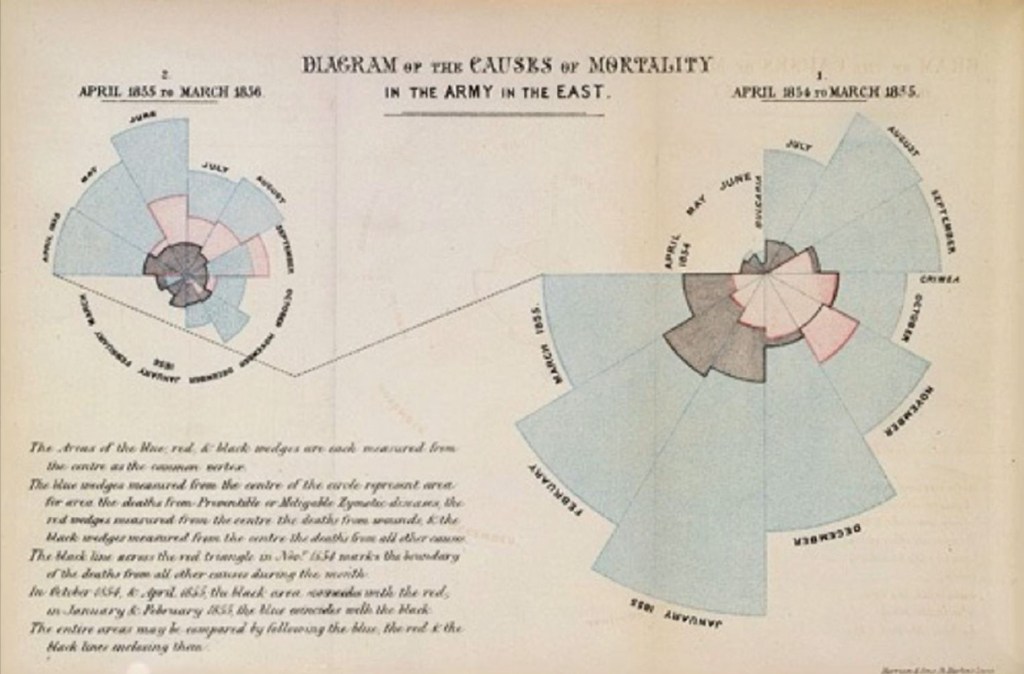
- Figure 1 is the original version of Florence nightingale’s famous graphs and were published in monographs that she produced later on.
- Figure 2 is a modified version of Nightingales famous graph created for a bit more clarity.
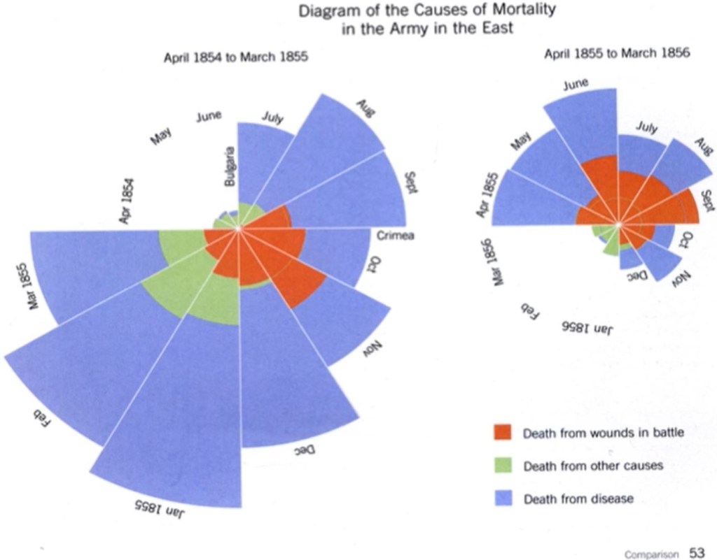
- Nightingale used to the graph to grasp the causes of death during the two years at Crimean War.
- The graph reveals that the real threat to British troops was not the Russians but disease.
- These comparisons are made through area on these graphs.
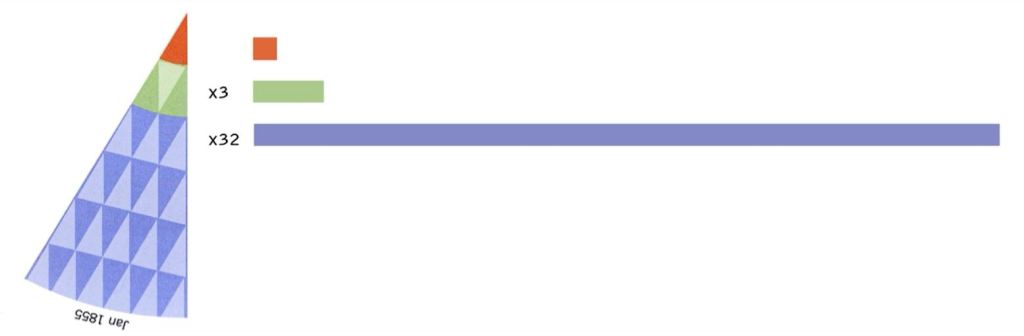
- Referring to Figure 3, by taking one wedge from the graph and superimposing the red triangle on the green we can see that the green area is approximately 3 x lager then the red area. These triangles can be replicated again over the blue wedge showing that its 32 x larger than the red.
- Here is a link to an interactive version that reproduces the original https://understandinguncertainty.org/coxcombs
Reflection
We can see through looking at past to present examples of the evolution of data visualisation. We can see how we are continually creating greater clarity to visualisations to enables our audience to grasp complex data with the least amount of work possible on their part. Data visualisation can reduce the time necessary for understanding complex data.
