- Why Visualise?
- We visualise to help us gain an insight and an understanding of inter-complex issues.
- Book – The Functional Art: An introduction to information graphics and visualisation by Alberto Cairo
- If you don’t present data to your reader so they can see it, read it, explored it and analyse it, they might not take your word.
- You need to convince them or give them the information that allows them to convince themselves.
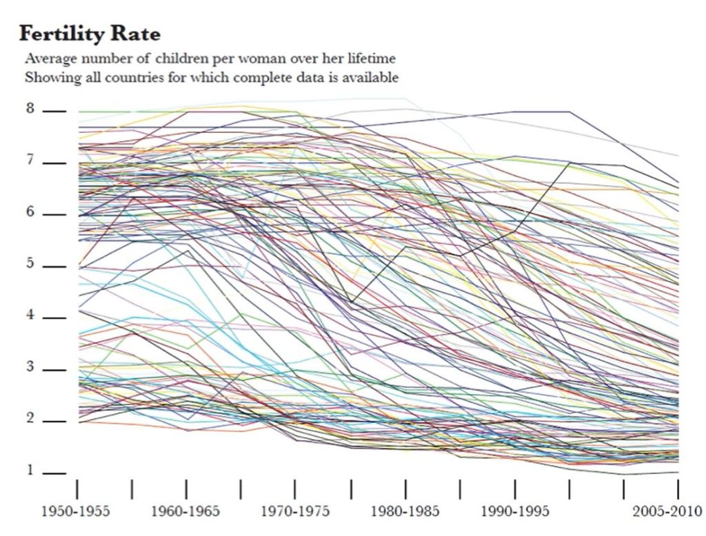
- Figure 1 shows women’s fertility rate in different countries. This chart may look interesting but it’s impractical in showing actual usable information. This is what you get when you let the software program do all the work, you need to do some design work as well not just accept whatever the program gives you. It makes no sense to make the all the lines equally visible. In information graphics, what you show can be as important as what you hide.
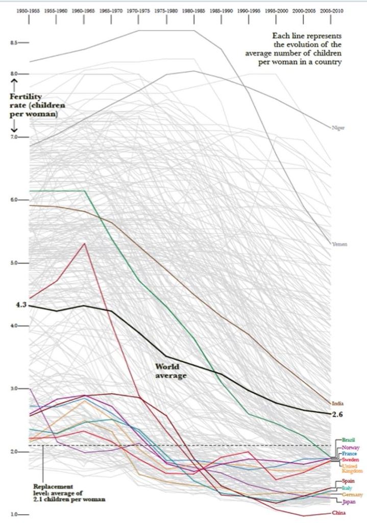
- Figure 2 is the same data with a few countries highlighted rather than all countries. You can make comparisons and are able to interrogate the data.
- A key requirement of visualisation is that readers should be given enough information to enable them to either follow a presented argument or use their own intelligence to do their own interpretation and extract their own meaning.
- The rise of ubiquitous use of information graphics has also produced a sub category of infographics or visualisations that have very little to offer, that obscure their lack of actual usable information with stylish emptiness (known as eye candy).
- The purpose of data visualisation is to create functional art that is beautiful and engaging.
Reflection
We were made to see the importance of what you show in visualisations can be as important as what you hide. Sometimes a chart could look really interesting but doesn’t show any usable information. By highlighting fewer variables, it can make it easier to make comparisons to the important information in the data.
