Why do we use graphs?
- To make comparisons easier
- There are a great range of different ways we can present data to achieve the goal of making comparisons easier
- Often graphic designers choose the wrong way because of aesthetic or what is trending at the time
- By comparing graph types, we are able to see which graph clearly communicates the data
- Bubble charts are an ineffective way to display data. Using circles leads us to always underestimate the size difference.
- In figure 1, it would be hard to determine the difference between the two years. Just looking at the bubble charge I would estimate that 2009 is half the capitalisation of 2007. When comparing this to the bar chart, it is evident that 2009 is roughly one third of 2007.

- The reason for this is because of the way our brain works. Our brain and eyes are good at comparing a single dimension, for instance length. We’re not very good at calculating more complex things like the surface area (the height multiplied by the width).
- You might make a graph wanting your readers to compare areas but what they will automatically do is compare heights or widths as calculating areas of circles is even more complicated then calculating areas of squares.
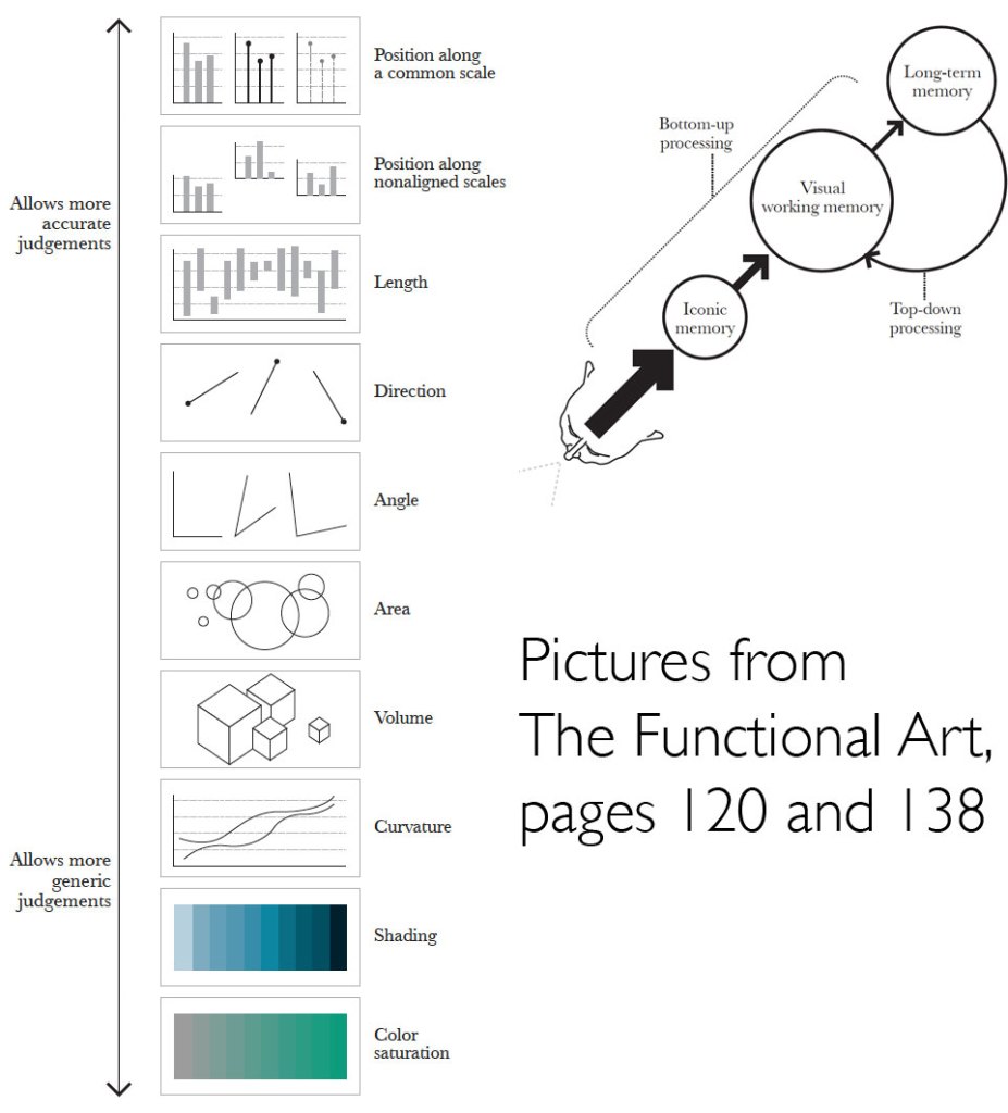
- Figure 2 is a ranking of different graphic approaches to comparing data
- Figure 2 is based on human visual perception
- We need to tailor the way that we present data, so it is able to be read and understood easily. We need to have some knowledge of the way our human perceptions work to be able to decide which way we going to present some data.
- The more accurate the data and easy for your readers to make a correct judgement, the more likely they’ll take away correct perception of the patterns presented.
- Looking at figure 2, looking at the arrow pointing to the top show the graphs that allow for more accurate judgement whereas the arrow point downwards shows graphs that allows more generic judgement.
- If you were comparing dollar values, you would need to use more accurate judgements whereas using shading as a general indicator to determine what’s higher in in the map we don’t need to know exact data.
http://www.thefunctionalart.com/2013/08/in-infographics-steal-what-you-need-but.html
- The three most common charts you might use are
- Time series chart – plotting changes over time. E.g. stock market
- Bar chart – makes comparisons between things
- Scatter plot – a variable on each axis
- Names of graph types and what they are used for
- A bar chart is used a lot as it is incredibly useful and easy to use, and most people have familiarity with them. Your audience already knows how to read a bar chart making it instinctive and quick to compare information at a glance. A good time to use a bar chart is when comparing data across categories.
- Line charts connect individual numeric data points to visualise a sequence of values. Their primary use is to display trends over a period over time.
- Pie charts should be used to show relative proportions or percentages of information. They are very commonly miss used. Limit the number of wedges on a pie chart to about 6. If you have more than 6 portions to communicate you should consider a bar chart.
Reflection
We use graphs to make comparisons easier and to make complex data easier to understand. Our brain and eyes are good at comparing a single dimension, for instance length. We’re not very good at calculating more complex things like the surface area. Keeping this in mind when creating visualisations can make a comparison of data more instinctive for the reader to process. Also by using common chart types enable the reading to instinctively know how to use the chart.
