Part 1: What is Data Journalism? – The Guardian
- The Guardian really are the pioneers of data journalism. The Guardian was the first ever data blogger’s and they’ve also had a strong root and history in data visualisation.
- Data journalism is telling a story using the power of data
- Data journalism is the use of key information sets, key data, and key reference elements to inform a story
- Its not just obtaining the data and putting it out there, it’s the processing that goes into it to work out what it tells you. You must ask the right questions to get the right answers
- You’re not confined to just using text or images because you are a newspaper, you can use an interactive map
- If you can provide your workings behind the story (being open and transparent) it makes those stories so much stronger
- Data journalism is the recognition of the power of measurement in helping public conversations and discourse in general
- Using programmatic techniques like scrapping, statistical analysis on data to find a story. Or using story telling techniques on data to reveal more patterns or trends.
- There are now several people across the organisation who work with data every day. From the research department to journalist to interactive designers and people who visualise data for living. The Guardian pull that stuff together and provide people with the destination who interesting data and interested in finding out the truth behind the stories.
Part 2: History of Data Journalism at The Guardian
- Data journalism relies on technology and didn’t exist before 2009
- Journalist at the Guardian have been wresting with data since the very first issue of 1821 and have been trying to present that data in interesting ways to bring those stories alive for the readers.
- The Manchester Guardian history
- Adverts on first page
- Data journalism in 1821 is really just a table of data
- Unless we know and understand what’s going on in the world through data like this then how can things improve and how can things get better
- Used graphics made up of type to represent of data – 1901
- War and military action are one of those areas that have always produced graphics and visualisations. Often you are visualising a place that people don’t really know about and is somewhere they’ve never been before, you are also trying to show what’s happening where (maps).
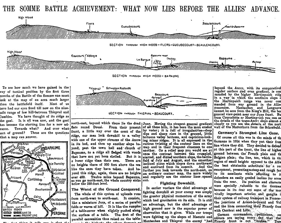
- Figure 1 is an article from the Guardian of ‘The Battle of the Somme’ in October 1916. The data shows both of kinds of data visualisation (maps and diagrams of what the place looks like). What this visualisation shows you is the groundwork of what is still to come after all those months of pain and incredible loss of life. It shows that they still have hills and very difficult land to get over. It shows the pain that lies ahead of the allies and its sections of the land have a little map so you can really imagine how difficult it would have been. Figure 1 shows what was still to come as the battle ground was on for another two months.
- Without colour, they needed to differentiate data using different crosshatching techniques – 1938
- Comparing data in history to 2013 we can map data in minutes that is interactive. We have speed on our side now in a way that people would have envied 20-30 years ago
Part 3: Data journalism in action: the London Olympics
- The video explained what went into producing the Guardian’s alternative Olympic medal table.
- They wanted to make something that people would understand.
- The were displaying the data through raw data but realised they needed to something visual to show this.
- They made a live visualisation that updated automatically – it was running off a Google spreadsheet. The Guardian updated the raw data everyday which changed the graphics live as it happened. The most important thing about any data supplied, whether it’s in spreadsheet any other way, is that it has to be precise, it has to be accurate and there has to be a logical way for the code to talk to it and know it’s going get back the right information.
- This sparks a conversation – the user can explore the data for yourself and tell us what you think it means. This engages the community
