Bill Shander of Beehive Media at KA Connect 2014
https://vimeo.com/100429442
Summary
To sum up the point of the ‘4X4 Model for Knowledge Content’ is to get the right knowledge, to the right people, at the right time. This simply means the model is about getting people to content [luring them]. Studies have shown that the majority of users who visit a website will leave it within 10 seconds of being on it. We need to understand that your audience is scanning for content. Through Bill Shander undertaking an eye tracking study, he discovered that users scan your website in an “F” like pattern, looking for something to grab their attention before committing themselves to your content. You’ll be lucky if they read even 20% of your content. This is where the 4X4 model comes into play.
The 4X4 Model for Knowledge Content – breakdown
- The first 4 – the four levels of content you need to create
- The second 4 – is the four key components you need to put into your content at all four of those levels
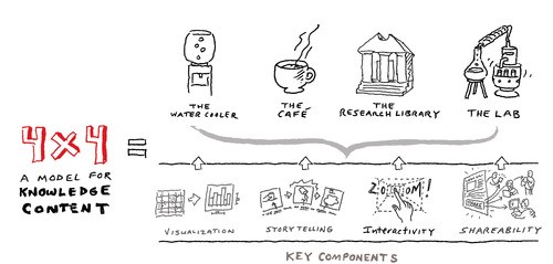
4 Levels of Content:
- The Water Cooler: comes from the idea of how people gather around a Water Cooler and exchange quick stories of subjects of interest during a brief breather from work. The content from these stories are succinct, direct and compelling making it to be thought as a headline, tweet or an ad. Online, Water Cooler moments are headlines, as they are the things that grab your attention that makes you know that this is something of interest. In a Water Cooler moment, you have decided if you’re interested or not and you engage more or not. A Water Cooler moment should be found throughout a web site — not just as headlines or ads, but also within the other layers of content.
- The Café: is a place for people to go for coffee and is an opportunity to dig into a subject at longer lengths. This isn’t a deep study and can be thought as a blog post, a 4-minute read article or a 3 to 5-minute video. Café content is the progression from the Water Cooler moments by the content does more than just introducing the ideas, it explains the ideas. Café content needs to be crafted in a way that it tells a compelling story that is easy to relate to. Café content is the visual and/or defying text that brings attention to the key points of an article.
- The Research Library: is a place where you investigate and learn about a topic. The audience will commit to looking through heavy text lengths to find the content that interests the user as long as you set up good Water Cooler moments and Café content along the way.
- The Lab: is the interactive data experience. This data was found in the Research Library content. You are giving your audience the ability to filter and sort and play with the data directly. It gives you the ability to turn the data story into something that is relevant to you.
4 Key Components:
- Visualisation: is communicating visually.
- 30-50% of your brain is devoted to visual processing;
- 70% of your sensory receptors are in your eyes;
- it takes 1/10th of a second to make sense of as visual scene opposed to reading a paragraph describing a scene. We immediately process things when we look at them.
- The picture superiority effect essentially says that if you’re learning something and you give that information with images versus without images, with images you’ll have 60% retention rate after 3 days opposed to 6% retention without images.
- If you think about the written language, it began as visual symbology. It was very literal. As language evolved it became more abstract, this is what aloud us to communicate more complex ideas through text using less space. This was a great thing but wasn’t the best way to communicate data.
- Storytelling: is how we communicate.
- At the beginning of time, the stories were told through drawings and the stories contained the data.
- Structure your content in terms of a story. Your headline is the beginning of your story, the subhead may be the challenge. You need to think about creating content in this manner. If you create it in a way that it can be consumed in a linear/story fashion, it will be a lot more impactful.
- Interactivity: is that tangible experience.
- Interactivity works because we are all narcissists. Essentially make it about me and I’ll be interested.
- Interactivity is offering engaging experiences that is more likely to be understood when the user is adding to the experience.
- Shareability: is the ease of sharing content.
- Sharing allows for better action for your content. It is able to reach more of your audience when it can be shared.
Why we need the 4X4 model?
- To solve these three primary challenges that we face as communicators:
- The conversation prism – we are now living in a gala land model of the web (Drew Davis), your website is not the centre of the universe, so if you want your content to be consumed by your audience, you need to understand where the conversations are happening and where people are looking for content.
- We now generate more data every two days than from the dawn of civilisation through 2003 – Eric Schmidt
- “I’m not being edutained!”
- The solution – there are design solutions to these challenges
- To understand that your audience is scanning for content. The design solution is to put certain things on your webpage to draw the eye to the content you want to draw the eye to. Be strategic, you can put a face on a page which will not only draw them to look at the face, but they will also look the content the face is looking at.
- The 4X4 model for knowledge content.
