Lecture Pod 08: Nathalie Miebach – Art made of data

  • Artist Nathalie Miebach takes weather data from massive storms and turns it into complex sculptures that embody the forces of nature and time (figure 1). These sculptures then become musical scores for a string quartet to play.
  • The musicians played off a three-dimensional graph of weather data. Every single bead, every single coloured band, represents a weather element that can also be read as a musical note.
  • Weather is a combination of systems that is fundamentally invisible to most of us. Artist Nathalie Miebach used a sculpture and music to make weather data, not just visible, but also tactile and audible.
Figure 1: Weather sculpture
Figure 2: Music notation

Reflection

Throughout all the lectures we have seen many examples of screen-based data visualisations. This example shows the possibility to make visualisations that are three-dimensional giving a tactile and audible experience.

Lecture Pod 07: David McCandless – The beauty of data visualisation

  • David McCandless turns complex data sets (like worldwide military spending, media buzz, Facebook status updates) into beautiful, simple diagrams that tease out unseen patterns and connections. Good design, he suggests, is the best way to navigate information glut.
  • We visualise information so that we can see the patterns and connections that matter and then designing that information, so it makes more sense and so a story can be told from it. It also allows us to focus only on the information that’s important.
  • Visualisations can be meaningless without context. Adding context gives you a different relationship to the numbers. You start to see patterns and connections between numbers that would otherwise be scattered across multiple news reports.
  • When looking for hidden patterns in the data the best way to discover them is when you visualise it.
  • If you’re navigating through dense information, coming across a beautiful graphic or data visualisation is a relief.
  • Humans sense of sight is the fastest, then your sense of touch, and then you have hearing and smell.
  • The eye is exquisitely sensitive to patterns in variations in colour, shape and pattern. It’s the language of the eye. If you combine the language of the eye with the language of the mind, which is about words and numbers and concepts, you start speaking two languages simultaneously, each enhancing the other.
  • It’s a way of squeezing an enormous amount of information and understanding into a small space. And once you’ve curated that data, and cleaned that data, you can do cool stuff with it.
  • Design is about solving problems and providing elegant solutions, while information design is about solving information problems.
  • Visualising information can give us a very quick solution to those kinds of problems. Even when the information is terrible, the visual can be quite beautiful. Often, we can get clarity or the answer to a simple question very quickly.

Reflection

In summary, David McCandless explains the beauty of data and how using information design can solidify enormous amounts of information into more understanding simplistic visualisations. Visualisations can be meaningless without context. Adding context gives you a different relationship to the numbers. We need to ensure that we are creating visualisations that have some sort of context to allow the readers to understand the entirely of a visualisation.

Lecture Pod 06: Data Journalism

Part 1: What is Data Journalism? – The Guardian

  • The Guardian really are the pioneers of data journalism. The Guardian was the first ever data blogger’s and they’ve also had a strong root and history in data visualisation.
  • Data journalism is telling a story using the power of data
  • Data journalism is the use of key information sets, key data, and key reference elements to inform a story
  • Its not just obtaining the data and putting it out there, it’s the processing that goes into it to work out what it tells you. You must ask the right questions to get the right answers
  • You’re not confined to just using text or images because you are a newspaper, you can use an interactive map
  • If you can provide your workings behind the story (being open and transparent) it makes those stories so much stronger
  • Data journalism is the recognition of the power of measurement in helping public conversations and discourse in general
  • Using programmatic techniques like scrapping, statistical analysis on data to find a story. Or using story telling techniques on data to reveal more patterns or trends.  
  • There are now several people across the organisation who work with data every day. From the research department to journalist to interactive designers and people who visualise data for living. The Guardian pull that stuff together and provide people with the destination who interesting data and interested in finding out the truth behind the stories.   

Part 2: History of Data Journalism at The Guardian

  • Data journalism relies on technology and didn’t exist before 2009
  • Journalist at the Guardian have been wresting with data since the very first issue of 1821 and have been trying to present that data in interesting ways to bring those stories alive for the readers.
  • The Manchester Guardian history
    • Adverts on first page
    • Data journalism in 1821 is really just a table of data
    • Unless we know and understand what’s going on in the world through data like this then how can things improve and how can things get better
    • Used graphics made up of type to represent of data – 1901
    • War and military action are one of those areas that have always produced graphics and visualisations. Often you are visualising a place that people don’t really know about and is somewhere they’ve never been before, you are also trying to show what’s happening where (maps).
    • Figure 1 is an article from the Guardian of ‘The Battle of the Somme’ in October 1916. The data shows both of kinds of data visualisation (maps and diagrams of what the place looks like). What this visualisation shows you is the groundwork of what is still to come after all those months of pain and incredible loss of life. It shows that they still have hills and very difficult land to get over. It shows the pain that lies ahead of the allies and its sections of the land have a little map so you can really imagine how difficult it would have been. Figure 1 shows what was still to come as the battle ground was on for another two months.
    • Without colour, they needed to differentiate data using different crosshatching techniques – 1938
    • Comparing data in history to 2013 we can map data in minutes that is interactive. We have speed on our side now in a way that people would have envied 20-30 years ago 
Figure 1: October 18, 1916 – The Somme Battle achievement: what now lies before the Allies. – The Guardian

Part 3: Data journalism in action: the London Olympics

  • The video explained what went into producing the Guardian’s alternative Olympic medal table.
  • They wanted to make something that people would understand.
  • The were displaying the data through raw data but realised they needed to something visual to show this.
  • They made a live visualisation that updated automatically – it was running off a Google spreadsheet. The Guardian updated the raw data everyday which changed the graphics live as it happened. The most important thing about any data supplied, whether it’s in spreadsheet any other way, is that it has to be precise, it has to be accurate and there has to be a logical way for the code to talk to it and know it’s going get back the right information.
  • This sparks a conversation – the user can explore the data for yourself and tell us what you think it means. This engages the community 

Lecture Pod 05: Data Presentation Styles – Why use Graphs?

Why do we use graphs?

  • To make comparisons easier
  • There are a great range of different ways we can present data to achieve the goal of making comparisons easier
  • Often graphic designers choose the wrong way because of aesthetic or what is trending at the time
  • By comparing graph types, we are able to see which graph clearly communicates the data
  • Bubble charts are an ineffective way to display data. Using circles leads us to always underestimate the size difference.
  • In figure 1, it would be hard to determine the difference between the two years. Just looking at the bubble charge I would estimate that 2009 is half the capitalisation of 2007. When comparing this to the bar chart, it is evident that 2009 is roughly one third of 2007.
Figure 1: Alberto Cairo – The Functional Art (2013) – Market Capitalisation of Societe Generale
  • The reason for this is because of the way our brain works. Our brain and eyes are good at comparing a single dimension, for instance length. We’re not very good at calculating more complex things like the surface area (the height multiplied by the width).
  • You might make a graph wanting your readers to compare areas but what they will automatically do is compare heights or widths as calculating areas of circles is even more complicated then calculating areas of squares.
  • Figure 2 is a ranking of different graphic approaches to comparing data
  • Figure 2 is based on human visual perception
  • We need to tailor the way that we present data, so it is able to be read and understood easily. We need to have some knowledge of the way our human perceptions work to be able to decide which way we going to present some data.
  • The more accurate the data and easy for your readers to make a correct judgement, the more likely they’ll take away correct perception of the patterns presented.   
  • Looking at figure 2, looking at the arrow pointing to the top show the graphs that allow for more accurate judgement whereas the arrow point downwards shows graphs that allows more generic judgement.
  • If you were comparing dollar values, you would need to use more accurate judgements whereas using shading as a general indicator to determine what’s higher in in the map we don’t need to know exact data.  
Figure 2: Alberto Cairo – the Function Art (2013) – A ranking of different graphic approaches to comparing data
http://www.thefunctionalart.com/2013/08/in-infographics-steal-what-you-need-but.html
  • The three most common charts you might use are
    • Time series chart – plotting changes over time. E.g. stock market
    • Bar chart – makes comparisons between things
    • Scatter plot – a variable on each axis
  • Names of graph types and what they are used for
    • A bar chart is used a lot as it is incredibly useful and easy to use, and most people have familiarity with them. Your audience already knows how to read a bar chart making it instinctive and quick to compare information at a glance. A good time to use a bar chart is when comparing data across categories.
    • Line charts connect individual numeric data points to visualise a sequence of values. Their primary use is to display trends over a period over time.
    • Pie charts should be used to show relative proportions or percentages of information. They are very commonly miss used. Limit the number of wedges on a pie chart to about 6. If you have more than 6 portions to communicate you should consider a bar chart. 

Reflection

We use graphs to make comparisons easier and to make complex data easier to understand. Our brain and eyes are good at comparing a single dimension, for instance length. We’re not very good at calculating more complex things like the surface area. Keeping this in mind when creating visualisations can make a comparison of data more instinctive for the reader to process. Also by using common chart types enable the reading to instinctively know how to use the chart.

Lecture Pod 04: Historical and contemporary visualisation methods – Part 2

  • Why Visualise?
    • We visualise to help us gain an insight and an understanding of inter-complex issues.
  • Book – The Functional Art: An introduction to information graphics and visualisation by Alberto Cairo
  • If you don’t present data to your reader so they can see it, read it, explored it and analyse it, they might not take your word.
  • You need to convince them or give them the information that allows them to convince themselves.
  • Figure 1 shows women’s fertility rate in different countries. This chart may look interesting but it’s impractical in showing actual usable information. This is what you get when you let the software program do all the work, you need to do some design work as well not just accept whatever the program gives you. It makes no sense to make the all the lines equally visible. In information graphics, what you show can be as important as what you hide.
Figure 1: Women’s fertility rate in different countries
  • Figure 2 is the same data with a few countries highlighted rather than all countries. You can make comparisons and are able to interrogate the data.  
Figure 2: Women’s fertility rate in highlighted countries
  • A key requirement of visualisation is that readers should be given enough information to enable them to either follow a presented argument or use their own intelligence to do their own interpretation and extract their own meaning.
  • The rise of ubiquitous use of information graphics has also produced a sub category of infographics or visualisations that have very little to offer, that obscure their lack of actual usable information with stylish emptiness (known as eye candy).
  • The purpose of data visualisation is to create functional art that is beautiful and engaging.

Reflection

We were made to see the importance of what you show in visualisations can be as important as what you hide. Sometimes a chart could look really interesting but doesn’t show any usable information. By highlighting fewer variables, it can make it easier to make comparisons to the important information in the data.  

Lecture Pod 03: Historical and contemporary visualisation methods – Part 1

  • We use visualisation to present large or complex data sets in a way that enables our audience to grasp those complexities with the least amount of work possible on their part.
  • One of the strengths of data visualisation is that it can reduce the time necessary for understanding a given event at the same time it augments the viewers capacity to grasp and interrelate the complex data. 
  • It’s much more than just representing a simple piece of information in a complex way. It is really about giving an audience tools to be able to analyse and make comparisons for themselves.

Florence Nightingale

  • Florence Nightingale served as a trainer of nurses during the Crimean War, in which she organised and care for wounded soldiers.
  • Nightingale realised that soldiers were dying of malnutrition, poor sanitation so she strove to improve the living conditions for the wounded troops. She kept meticulous records of the death tolls in hospitals as evidence of the importance of patient welfare and she turn those records into graphs to put an argument to the British military combat commanders.
  • Figure 1 is the original version of Florence nightingale’s famous graphs and were published in monographs that she produced later on.   
Figure 1: Florence Nightingale, Crimean War 1858
  • Figure 2 is a modified version of Nightingales famous graph created for a bit more clarity.
Figure 2: Florence Nightingale, Crimean War 1858 – Modified Version
  • Nightingale used to the graph to grasp the causes of death during the two years at Crimean War.
  • The graph reveals that the real threat to British troops was not the Russians but disease.
  • These comparisons are made through area on these graphs.
  • Referring to Figure 3, by taking one wedge from the graph and superimposing the red triangle on the green we can see that the green area is approximately 3 x lager then the red area. These triangles can be replicated again over the blue wedge showing that its 32 x larger than the red.
Figure 3: Florence Nightingale – Understanding how to read the data

Reflection

We can see through looking at past to present examples of the evolution of data visualisation. We can see how we are continually creating greater clarity to visualisations to enables our audience to grasp complex data with the least amount of work possible on their part. Data visualisation can reduce the time necessary for understanding complex data.

Lecture Pod 02: Data Types – Levels of Measurement

Data Types

  • Nominal
  • Ordinal
  • Interval
  • Ratio
Figure 1 – data types broken down in numerical & categorical data

Nominal data

  • Nominal data = a category
  • Latin word nomen – pertaining to names.
  • Nominal data consists of named categories in which the data fall.
  • Nominal data is unordered with no mathematical values.
  • It is a type of data that is used to label variables without any quantitative value
  • Nominal data can be counted and used to calculate percent, but you can’t take the average
  • When there are only two categories available the data is referred to as dichotomous.
  • Example
    • Grocery categories

Ordinal data

  • Ordinal = order
  • No category on an ordinal scale has a true mathematical value.
  • Numbers are assigned to the categories to make the data analysis easier.
  • Example
    • Positions in a race
    • Survey questions that have answer scales like strongly disagree, disagree, neutral, agree and strongly agree – seen in figure 2
Figure 2 – survey question answer scale ordinal data

Interval data

  • Interval data is a data type which is measured along a scale, in which each consecutive point is placed at equal distance from one another.
  • Interval data is numeric
  • Interval data doesn’t have a meaningful zero point.
  • The value of zero doesn’t indicate the absence of the thing your measuring.
  • The lack of a zero point makes comparisons of direct scales impossible.
  • Scenario
    • 0am isn’t the absents of time, it just means it’s a start of a new day
    • A temperature of zero doesn’t mean there is no heat.  
  • Examples
    • Temperature
    • Time of day
    • Calendar
    • Years

Ratio data

  • Ratio = numeric
  • Ratio data is defined as a quantitative data.
  • It does have a meaningful zero point.
  • The values of zero indicates an absence of whatever your measuring.
  • Zero means you don’t have anything of that type
  • Scenario
    • Zero minutes
    • Zero people in the line
  • Examples
    • Height
    • Weight
    • Age
    • Time
    • Money
Figure 3 – data types example

Qualitative data

  • Refers to non-numeric data
  • Descriptive and information

Quantitative data

  • Refers to numeric data; quantifiable
  • Numerical and information
Figure 4 – qualitative & quantitative data

Reflection

Data can be organised into categorical and numerical data. Ordinal and nominal are categorical data which means that the data is collected in groups or categories. Numbers don’t often make sense unless meaning assigned to those numbers. Interval and ratio are numerical data. Numerical data is data that is measurable like height, weight, etc. You can sort the data in either ascending or descending order.

Lecture Pod 01: Introduction to Data Visualisation – Infographics & Data Visualisation

What is data?

  • Data is a measurement.
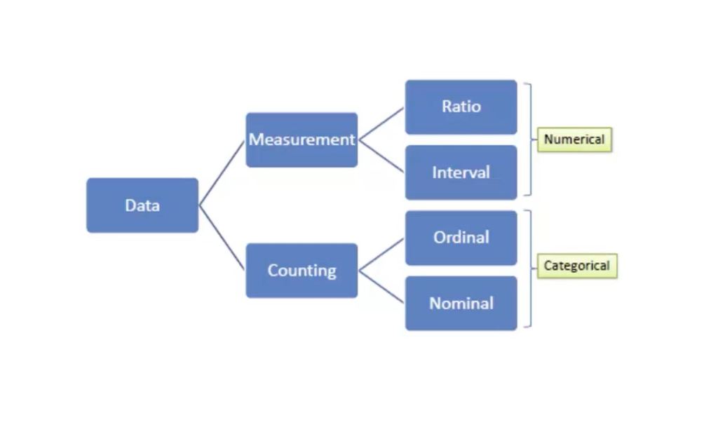
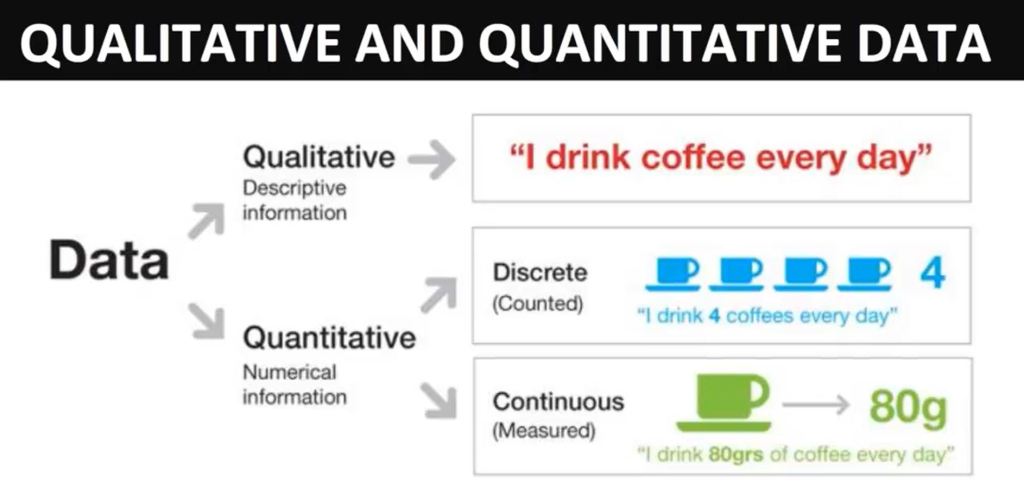
  • Data are values of qualitive or quantitative variables belonging to a set of items.
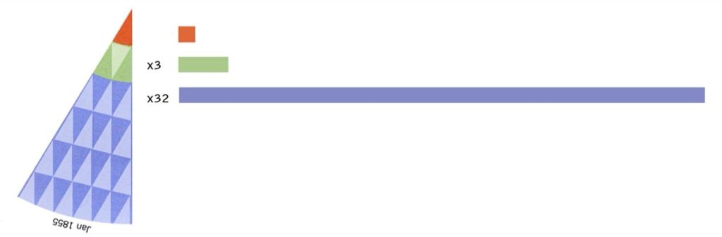
  • Data are typically the results of measurements and can be visualised using graphs or images.
  • The terms data, information and knowledge are frequently used for overlapping concepts.
  • Data by itself carries no meaning; for data to become information it must be interpreted and take on a meaning.

What is data visualisation?

  • Data visualisation is the visualisation of data.
  • Data visualisation is viewed by many disciplines as a modern equivalent of visual communication.
  • It involves the creation and study of the visual representation of data. This is further explained through the words of Michael Friendly (2008) as,

“information that has been abstracted in some schematic form, including attributes or variables for the units of information”.

  • Data visualisation is one of the steps in analysing data and presenting it to users.
  • The primary goal of visualisation is to communicate information clearly and efficiently using statistical graphics, plots and information graphics.  

Information graphics v data visualisation

  • Not all information visualisations are based on data, but all data visualisations are information visualisations.
  • Infographics are not based on data.
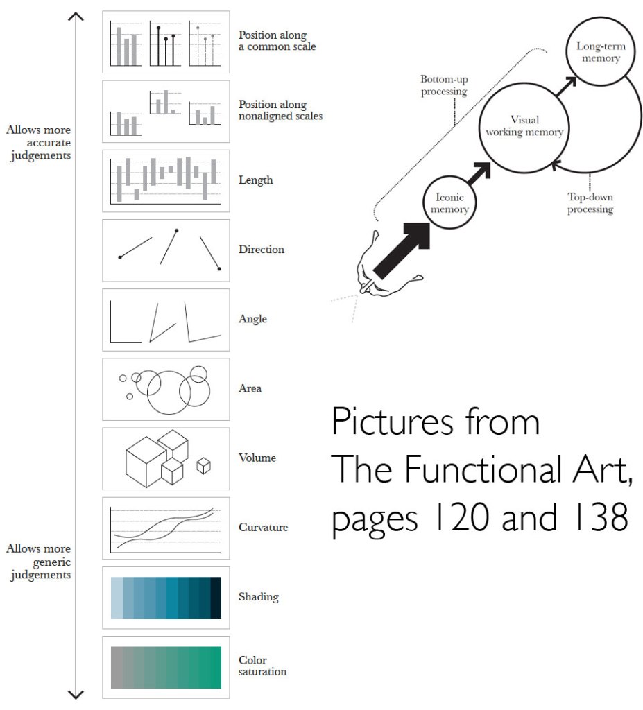
  • Effective visualisations help users analyse and reason about data and evidence.
  • Visualisations make complex data more accessible along with easy to understand and use.
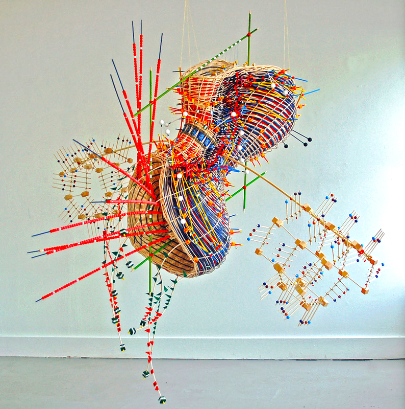
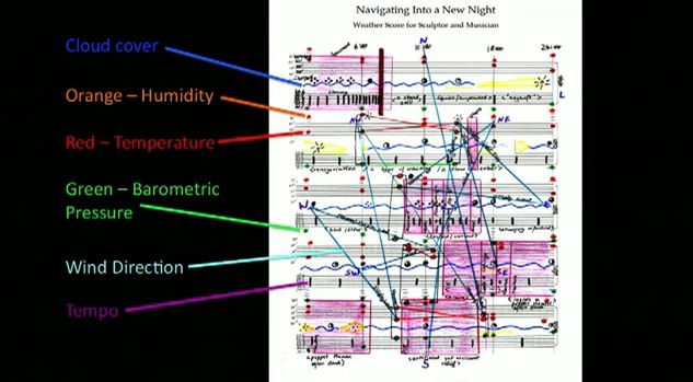
  • Data visualisation is both an art and a science.
  • The focus of data visualisation is choosing the right visualisation type for different data sets. As well as wrangling data which is organising data so it can be used in our visualisations.
  • Wrangling data is the of process cleaning and unifying complex data sets for analysis to create ease in transforming and mapping data sets into visualisations that has an intended purpose.

Types of data visualisations

  • Bar chart – best used for communicating two variables
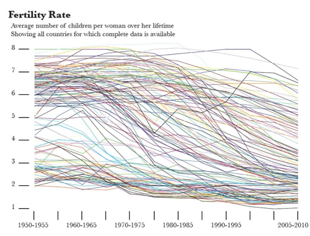
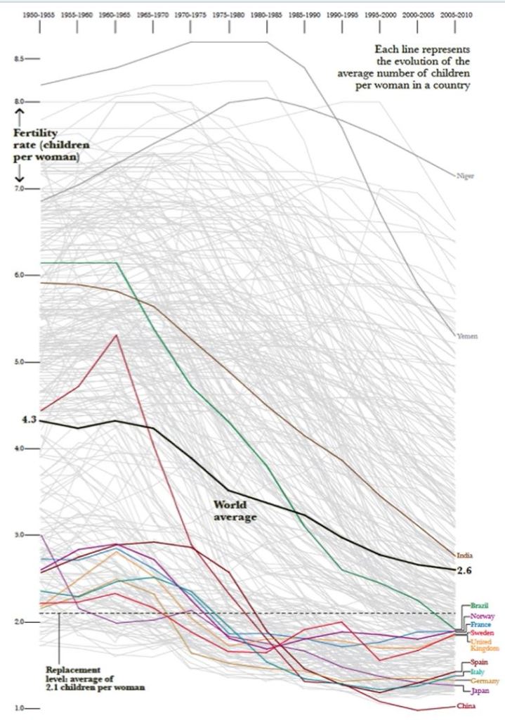
  • Line chart – best used for data over time
  • In using a basic chart your audience knows them well, which means they can be immediately recognised by them, they know how to read them and they won’t be confused by them.
  • We need to ensure we understand our audience and how they read images and take this in account when designing visualisations.

Reflection

Data visualisation is the graphical representation of information and data. It is another form of visual art that is aimed to convey useful information in an engaging way. A chart enables us to quickly see trends and outliers. If we can see something, we interpret it quickly. Data visualisation is storytelling with a purpose. A spreadsheet of data can be hard to process and can be overwhelming to look at. Data visualisations are a much more effective and intuitive way to convey information.