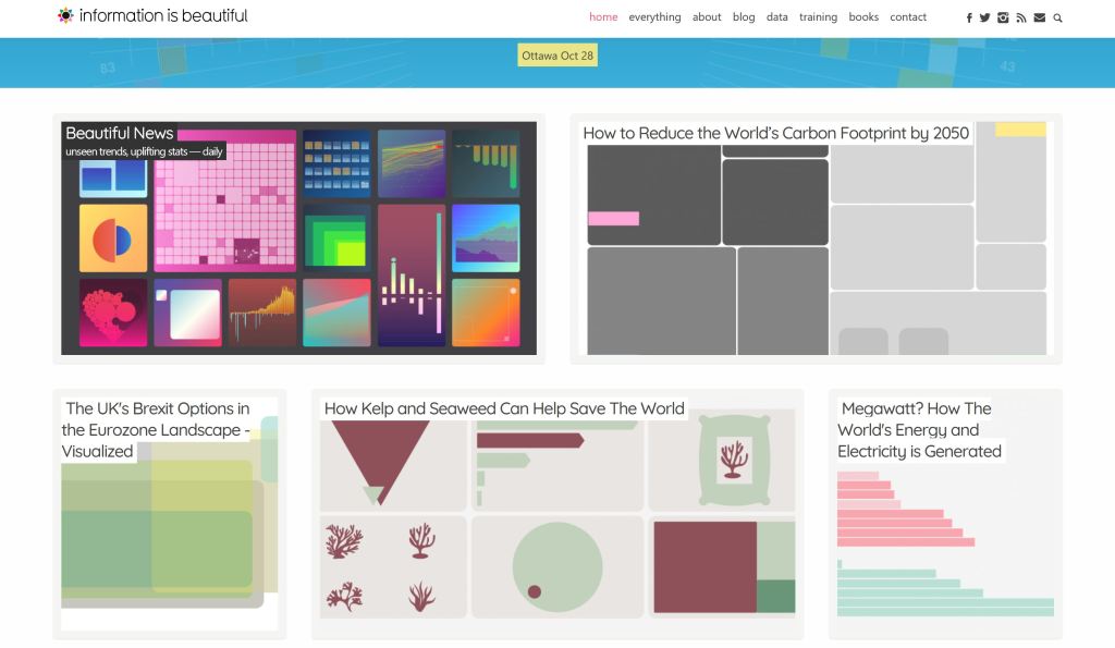
Information is beautiful
Creating the world’s data, information & knowledge into beautiful infographics & visualisations.
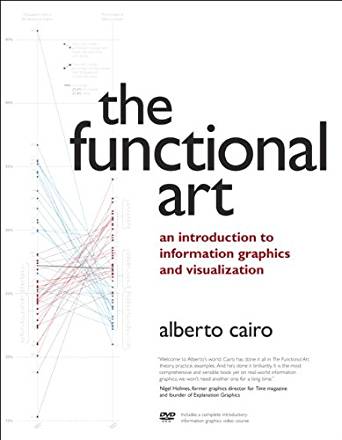
The Functional Art
The Functional Art by Alberto Cairo is a weblog about information design and visualisations. There has been a book created about information design and visualisations as well as tutorials to help support your learning which is available on the website.
Flowing Data – Time use
Flowing Data explores how statisticians, designers, data scientists, and others use analysis, visualisation, and exploration to understand data. This particular link is relevant to time use which is what we are exploring in this unit.
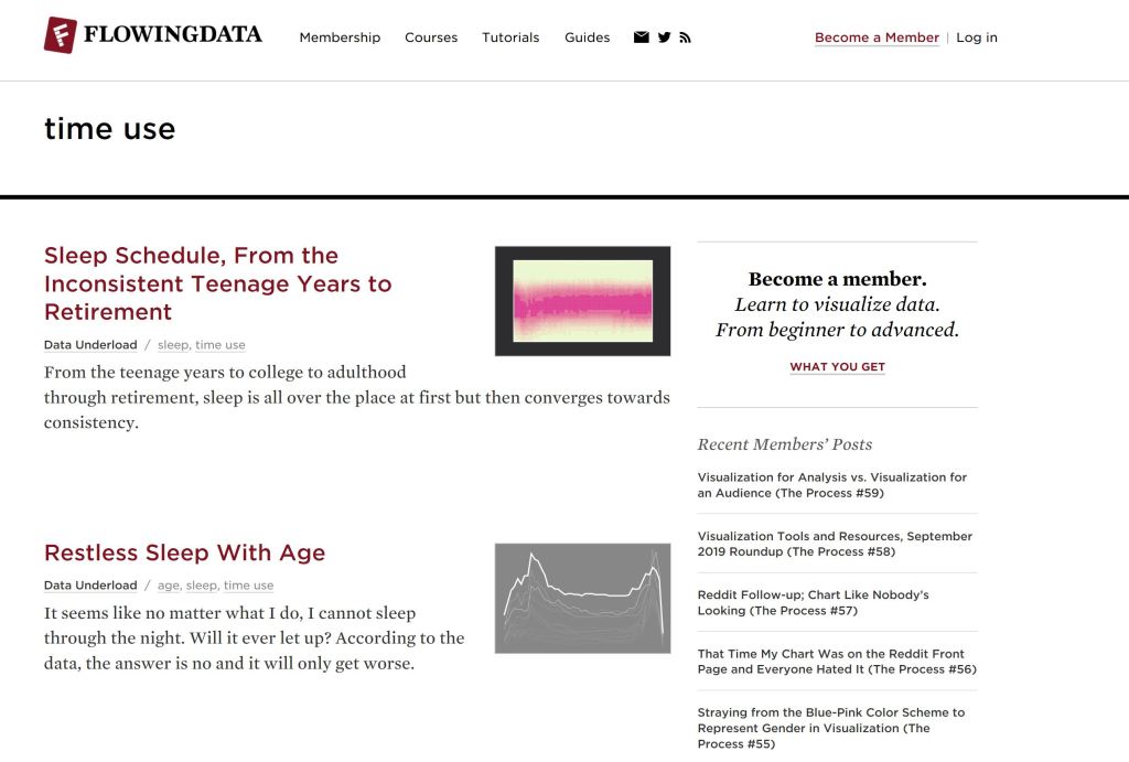
https://flowingdata.com/tag/time-use/
Data is Beautiful
A great source for data visualisations to critique.

Our World in Data
Our World in Data focuses on large world problems of poverty, disease, hunger, climate change, war, existential risks, and inequality. Their goal is to make the knowledge on the big problems accessible and understandable.